The imagining and re-imagining of the 1975 $50 bill
Bank note development is a process that can involve more than a dozen contributors at any given stage. And at every stage, major changes can occur. But for the Scenes of Canada $50 bill, these changes seemed especially dramatic.
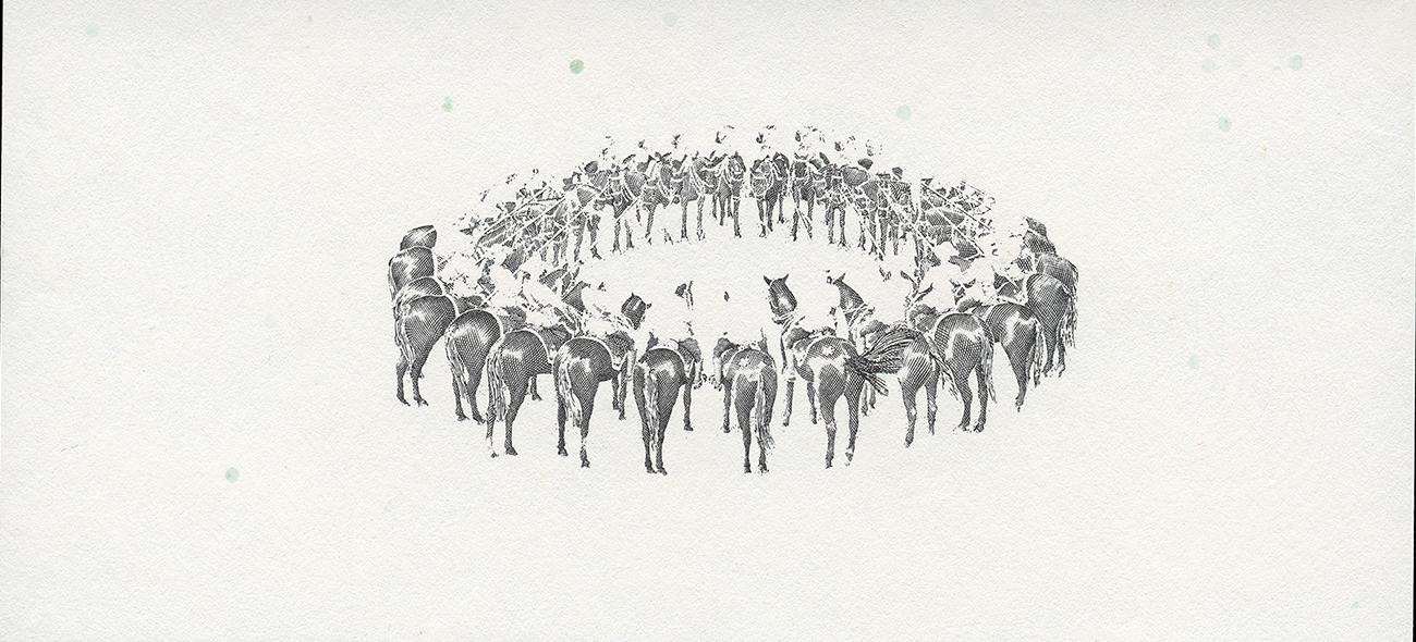
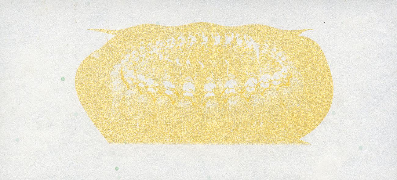
Among this note’s various design proposals were three images, three thematic colours and even three printing methods. 50 dollars, Canada, 1975 NCC 1975.70.1
Sometimes the colour drives the image choice
There could be few more stereotypically Canadian scenes than a lonely, snow-covered cottage on the rocky shores of a frozen northern lake. This was the image originally intended to appear on the back of the 1975 $50 bill. For a series of bank notes with a theme of “landscape with human activity” it seemed an ideal choice. But there was a problem.
The original photograph chosen for the back of the $50 bill is here reproduced as a painting in preparation for engraving. Painting, Canada, 1971, NCC 1993.56.576
The issue was with the colour. The established thematic colour of Canadian fifties was a bright orange. Unfortunately, it showed few images well—engravings tended to lose contrast and depth. With its many subtle tones, the frozen lake scene was not a good candidate for this colour. So, a new photograph was chosen.
The visual disadvantage of the orange ink is clearly demonstrated by comparing the 1937 (left) with the 1935 version of our $50 bill. 50 dollars, Canada, 1937 NCC 1974.59.2 / 1935, NCC 1984.23.3 and richly in maroon (right)")
Sometimes the image drives the colour choice
Curiously, the new choice was not a landscape at all, but a scene of a ballet company in performance. It was an elegant image and the George Gundersen engraving of it a magnificent example of the engraver’s art. Ironically, at about the time of choosing an image more suitable for the orange theme, the development team decided to abandon the colour.
As it turned out, the ink had more than one strike against it. The flattened tonal range that so limited the choice of images also made spotting a counterfeit more difficult. But the decisive strike was in the ink itself: poisonous heavy metals. The team instead opted for slate grey, a dark greenish colour.
The National Ballet of Canada performs a scene from Swan Lake. The engraving was tested in slate grey ink on a $20 back frame. The $50 back design had not yet been developed. $20, test note, Canada, 1965–70, NCC 1993.56.495
Dark inks in the grey and green ranges show engravings well. The high contrast brings out fine details, presenting a serious challenge to a counterfeiter. But engraver George Gundersen was not happy with this ink choice. Despite a reproduction rich in detail, he felt slate grey made the image appear lifeless. To show the ballet vignette to its best advantage, Gundersen recommended a colour in the purple to red range: between what he called orchid and claret. The grey was rejected, and the red $50 bill was born. But then the image was changed again!
Timing changes everything

George Hunter, who shot the images for the $5 and $10 bills, was on hand to shoot this image. But he was moved aside to allow the RCMP photographer the camera position. Photograph, Donald K. Guerrette, Canada, 1972 NCC 1990.57.30
The development of this note coincided with the centennial of the Royal Canadian Mounted Police (RCMP). A scientific advisor in the Currency Department proposed that the note could honour the RCMP during its time of celebration. This proposal was accepted. So, yet another image was selected for this note: a photograph of the RCMP Musical Ride in its dome formation. But this note’s long design journey was far from over.
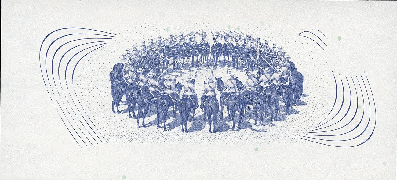
The $50 bill, like all previous Bank of Canada notes, was expected to feature a large engraving on the back. What we call “engraving” is really a printing process called “intaglio,” which begins by carving (engraving) an image onto a steel plate. The image areas are filled with ink and, under the extreme pressure of a printing press, the ink is transferred to paper. The resulting monotone prints are exquisitely detailed with a slightly raised surface. The engraver assigned to execute the RCMP image was a gifted 20-year veteran of the Canadian Bank Note Company, Yves Baril. But this engraver had an ambitious plan.
Mr. Baril’s surprising proposal
Baril’s plan was to create an intaglio vignette, but in full colour. He would engrave several plates, and each would be of an aspect of the image that could be represented by just one colour. When the images were printed one top of another, a full-colour scene could be created.
Baril’s plan demanded the highest of engraving skills—and it succeeded. But despite the beautiful results, this printing process was considered too laborious and expensive to be practical, so a final major change occurred to this note. Another printing method was proposed.
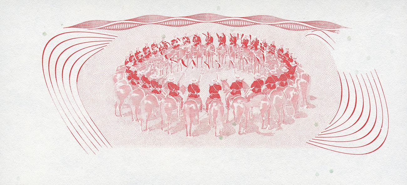
One of Yves Baril’s test prints for his multi-plate intaglio process. Note the edges of the colour layers visible around the RCMP image. The three middle patches demonstrated how the colours mixed in patterned but empty areas. Die proof, Canada, 1974, NCC 2011.67.1326
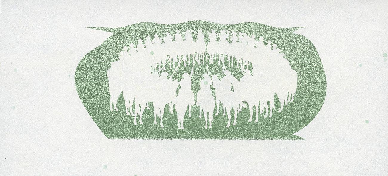
An engraver embraces lithography
Baril proposed the same layered approach as in his intaglio experiment but using lithographic plates instead. Modern lithography uses a photographic, chemical process to create individual plates. Baril produced five lithographic plates, each carrying one of the fundamental colours seen in the image. They were printed one on top of the other, as in his previous experiment. The resulting vignette was like nothing ever before seen on Canadian money. Richly colourful, it was the signature feature of what became one of Canada’s most popular bank notes.
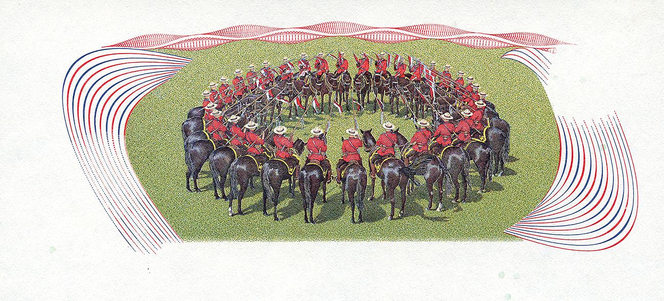


Lithography can replicate photographs, but this was never meant to look like a photograph. The careful layering of basic colours produced a far bolder image. 50 dollars, die proofs, Canada 1974–1986, NCC 2011.67.1562.032–037
A pivotal bank note
The $50 bill issued in 1975 heralded the end of the traditionally engraved vignette. Lithography took over most of our bank note imagery for all the following series. In this way, Yves Baril became the bridge between Canada’s old school of bank note printing and the future. For the 1986 Birds of Canada series, the back vignettes were entirely lithographic. Baril prepared three of the bird images for lithography and hand-engraved the portraits of Sir Wilfrid Laurier and Sir Robert Borden. He retired in 1996, just before planning began for the Canadian Journey series.
The vignette on the $50 bill was a wild departure from the monochrome images of the rest of the series and, indeed, all previous Canadian bank notes. 50 dollars, Canada, 1975 NCC 1975.70.1
Intaglio printing may have taken a back seat to lithography, but it never disappeared. Still used for portraits and other details of bank notes, intaglio’s raised print is a valued tool in the Bank’s defence against counterfeiters. And it is still a beautiful feature.
We want to hear from you! Do you have an idea for a blog post you’d like to see?
Content type(s):
Blog posts
The Museum Blog
June 22, 2026

Reminiscences of the 1976 Montréal Olympic Coin Program
By: David Bergeron
The Olympic Coin Program was novel, ambitious, record-breaking and for some, life-changing—much like the Olympic Games that the program helped finance.
Content type(s):
Blog posts
May 26, 2026

The changing face of women on bank notes
By: Krista Broeckx
From queens to changemakers, discover how real women are finding their place on bank notes around the world.
Content type(s):
Blog posts
February 10, 2026

Love tokens: Change of heart
By: Graham Iddon
For centuries, people have been adding alternative messages to coins as political protests, advertising, commemoration and—most charmingly—love and affection. Such things are called love tokens.
Content type(s):
Blog posts
Subject(s):
Arts,
History
January 20, 2026

Three 50-cent pieces: The big changes to our small change
By: Graham Iddon
The maple leaves, beavers, schooners and caribous appear unchanged every year on our regular issued coins. But the 50-cent piece is a different story, because every time our coat of arms has changed, so has the coin.
Content type(s):
Blog posts
December 22, 2025

New acquisitions—2025 edition
From rare toonies to Métis scrip art, the Bank of Canada Museum’s 2025 acquisitions show how money and the economy shape Canadian lives.
Content type(s):
Blog posts
August 21, 2025

Whatever happened to the penny? A history of our one-cent coin.
By: Graham Iddon
The idea of the penny as the basic denomination of an entire currency system has been with Canadians for as long as there has been a Canada. But the one-cent piece itself has been gone since 2012.
Content type(s):
Blog posts
Subject(s):
History