Say hello to our new logo
Corporate logos are everywhere. They are so prevalent and deceptively simple that we often don’t recognize that they are extraordinarily sophisticated little symbols that carry a disproportionate amount of communication responsibility. For good reason, logo design is an elite field of an already complex business; the brainiest of all graphic design. To quote legendary graphic designer Paul Rand:
The principal role of a logo is to identify, and simplicity is its means... Its effectiveness depends on distinctiveness, visibility, adaptability, memorability, universality, and timelessness.
That’s a tall order. It’s all about identity, and part of the process of rebuilding a museum like ours is to rebuild its identity. The logo is a key feature and becomes nearly as important as the design of the museum itself because the logo is often the first impression that people will get of it. If our sophisticated new museum has a logo that looks like it belongs on a box of breakfast cereal, we may have difficulty attracting an audience. Conversely, it is possible to have a logo that is too impressive, that promises too much. Mr. Rand speaks again:
A logo derives meaning from the quality of the thing it symbolizes, not the other way around.
In the case of our logo development, many questions needed to be answered. Does it reflect our content? Is it memorable? Is it unique? Will it work alongside the Bank of Canada logo? Does it evoke our building? Can it work in multiple sizes? Does it make me look fat? OK, that last one’s pretty low on the list, but all the demands made upon this humble little design are a bit mind-boggling.
This highly adaptable design can be tilted, shifted, stretched and overlaid in many different ways and colours for any number of uses.![]()
And here it is. What do you think? Nice, eh? We like it. It’s a very flexible design and right now our graphics team is busy adapting it to a dozen different uses and formats. We believe it will serve us a long time and now we just have to make sure our new museum will be up to our logo’s standard. No problem there.
We want to hear from you! Do you have an idea for a blog post you’d like to see?
Content type(s):
Blog posts
The Museum Blog
November 6, 2014

The Adventure of Exhibit Planning VI
By: Graham Iddon
This is not the time for ‘nay sayers’. Basically, we planned a luxury car knowing that when all was said and done, it was going to be a very nice family sedan (maybe with the big engine?).
Content type(s):
Blog posts
September 29, 2014

The Adventure of Exhibit Planning V
By: Graham Iddon
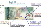
Now the writer takes a deep breath and attempts to take a subject like the ‘representation of 75 years of national identity as depicted on stamps and bank notes’ from 50 pages of research and squash it into 65 words.
Content type(s):
Blog posts
August 6, 2014
The Senior Deputy Governor’s Signature
By: Graham Iddon
For much of their history, Canadian bank notes have represented a promise, a guarantee that they could be redeemed for “specie” (gold and silver coins) at their parent institution.
Content type(s):
Blog posts
July 28, 2014
Becoming a Collector V
By: Graham Iddon
Suppose you walk into a bar frequented by currency collectors and in an attempt to join in you refer to a ‘planchette’ as a ‘rosette’ (beer mugs hit the tables and the pianist stops playing). This could be pretty humiliating and you’ll probably never be able to go to that bar again, at least not on numismatic night.
Content type(s):
Blog posts