The Scenes of Canada $20 bank note and the birth of a series
The $20 of 1969 was the series prototype. Yet, as more notes were designed, the theme—and the $20 note itself—would change.

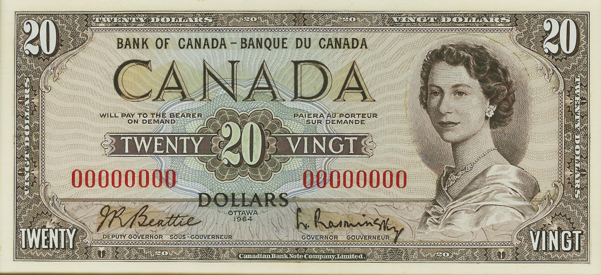
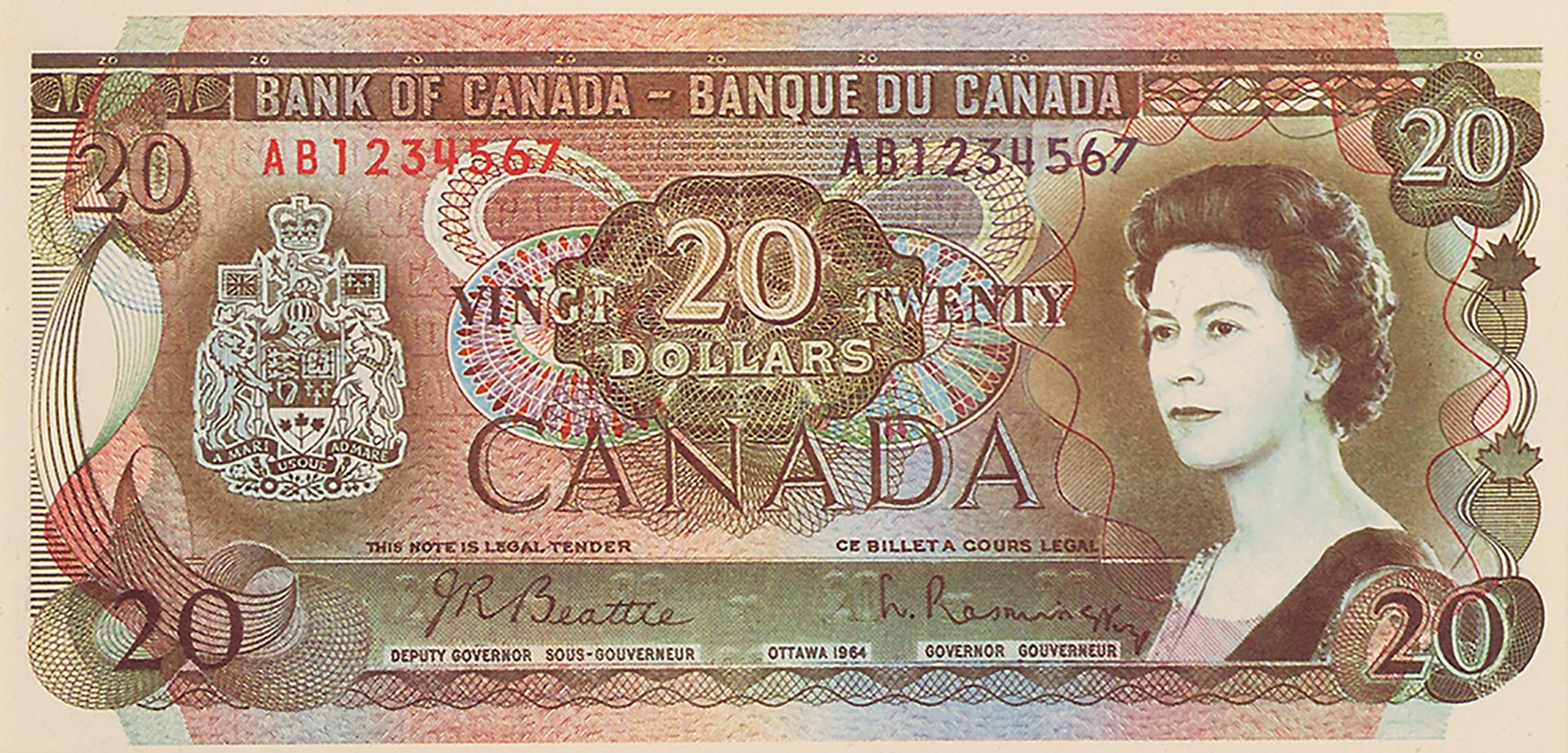
British royal photographer Anthony Buckley took this photograph of the Queen in 1963. The engraving is by George Gundersen. This note is the second version of the Scenes of Canada $20.
Source: 20 dollars, Canada, 1979, NCC 1978.186.1
Calling all security printers!
In 1963, the Bank of Canada requested proposals from security printing firms for a new bank note design. Firms from Canada, Belgium, Great Britain, France and Switzerland competed for the contract, sending a small flood of $20 bill models to the Bank. Most of these models shared a common feature: complex visual detail—and lots of it. Multiple colours, elaborate motifs and guilloche (mechanically produced decoration similar to Spirograph patterns) were evident on some very busy bank note designs. It was the counterfeit defence of the day—create a note of such subtly complex design and colouring that it would be extraordinarily difficult to believably copy.
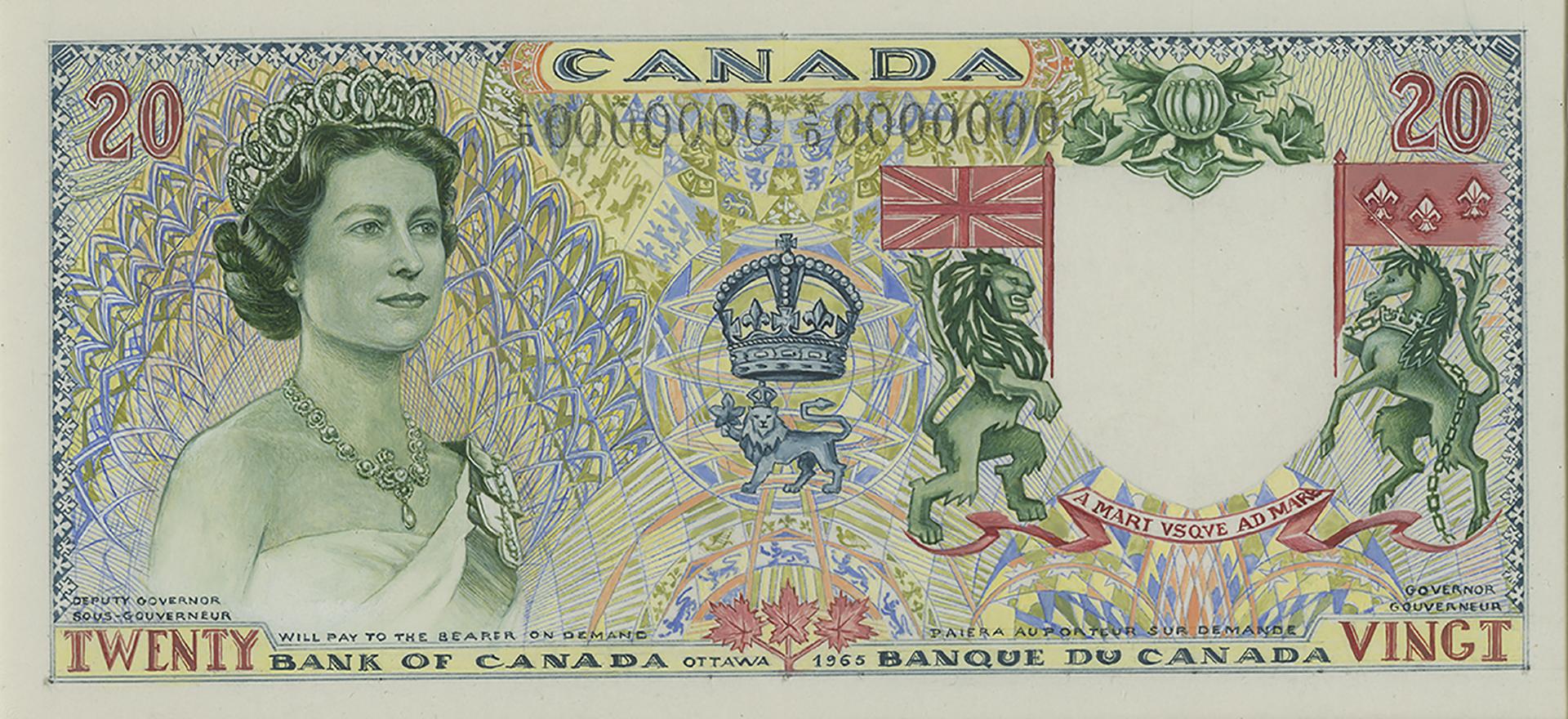
This is a mere fraction of the dozens of bank note models presented from 1963–65. Some are modest variations on the previous series, while others show fresh, bold departures in colour and pattern.
Source: 20 dollars, back and front models, Canada, 1963–1965
Sadly, beauty isn’t a great security feature
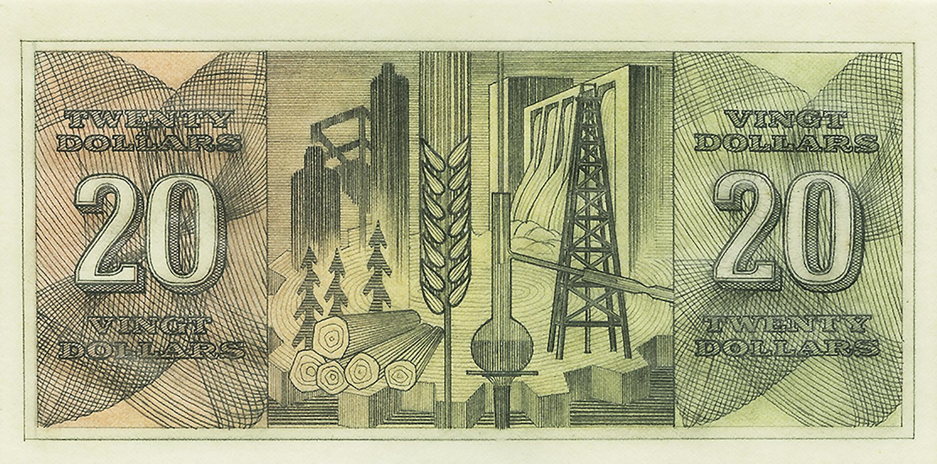
One proposal did not conform to the general notion of complicated imagery. It was simply beautiful—and beautifully simple. Thought to be created by George Fanais of the British American Bank Note Company, these images of Canadian industry were restrained, elegant and dignified. The just-right placement of the vignettes in a frameless horizontal format would tickle any graphic designer. Gorgeous—but the Bank was looking for some serious security protection.
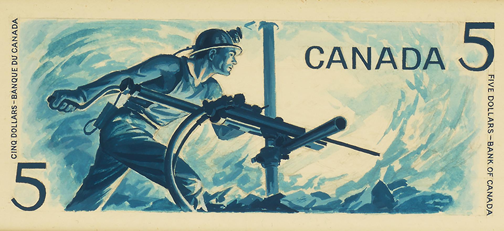
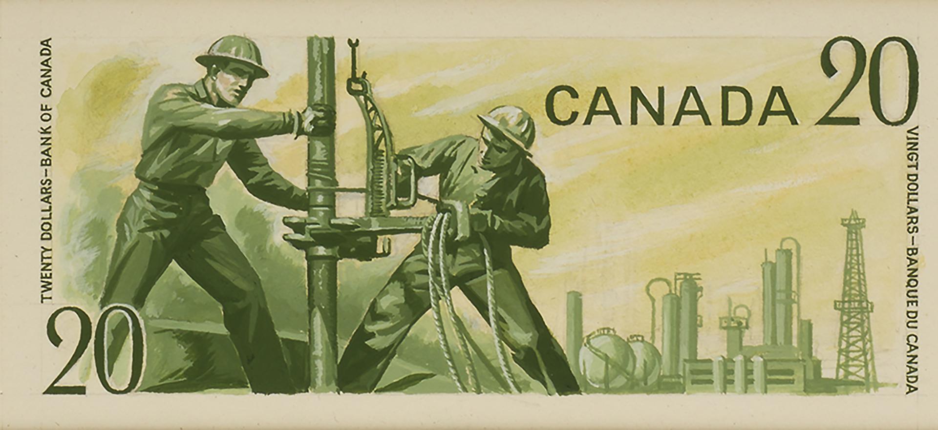
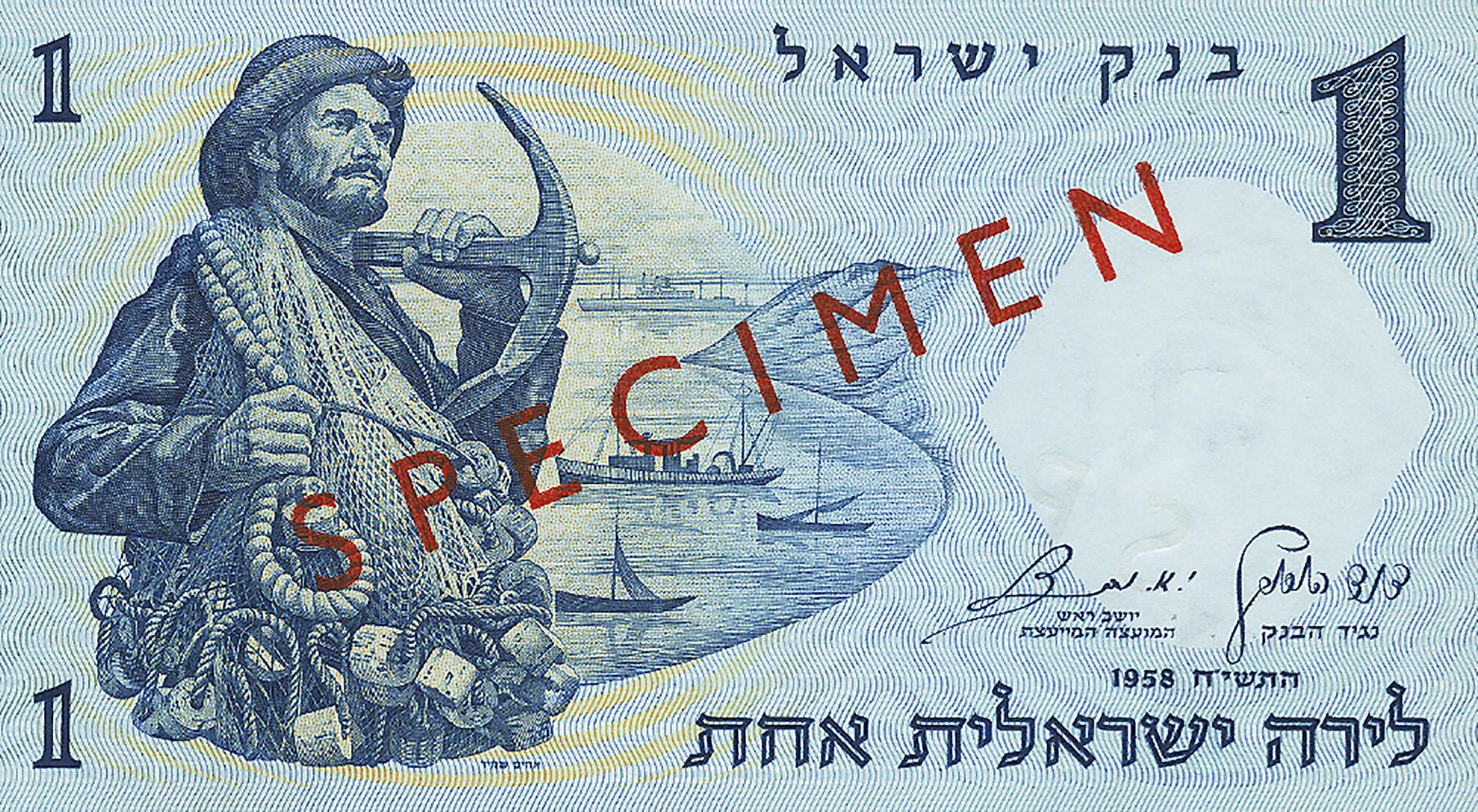
Compare these four note models (possibly designed by George Fanais) with this late 1950s note by Israeli graphic design team, the Shamir Brothers—was it an influence?
Source: $1, $2, $5, $20, back models, Canada, 1964, NCC 2013.19.70–73 | 1 lira, Israel, 1959 NCC 1962.27.439
The contract goes overseas

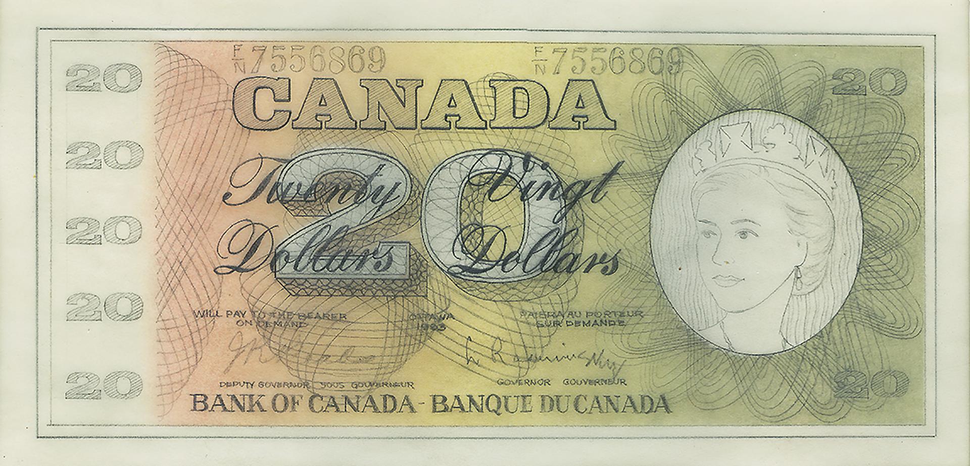
The Thomas de la Rue winning entry was submitted in July 1964. It is surprisingly close to the final design.
Source: 20 dollars, front model, Thomas de la Rue, Canada, 1964 NCC 2011.67.1024
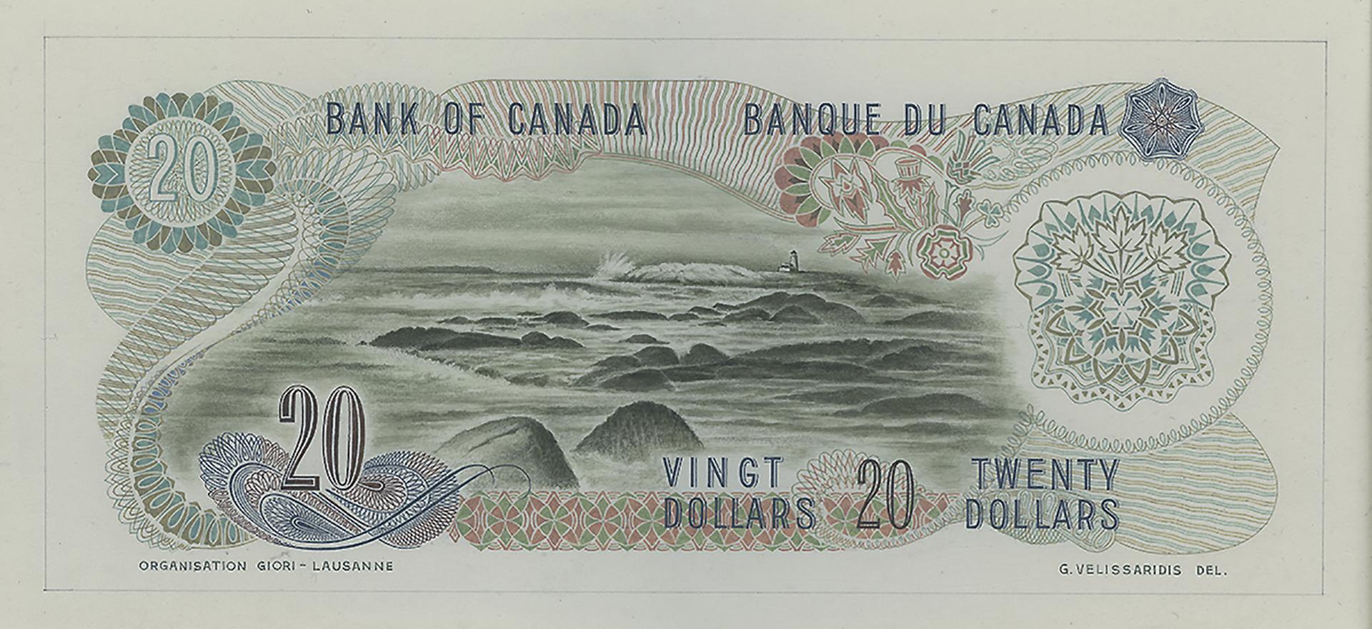
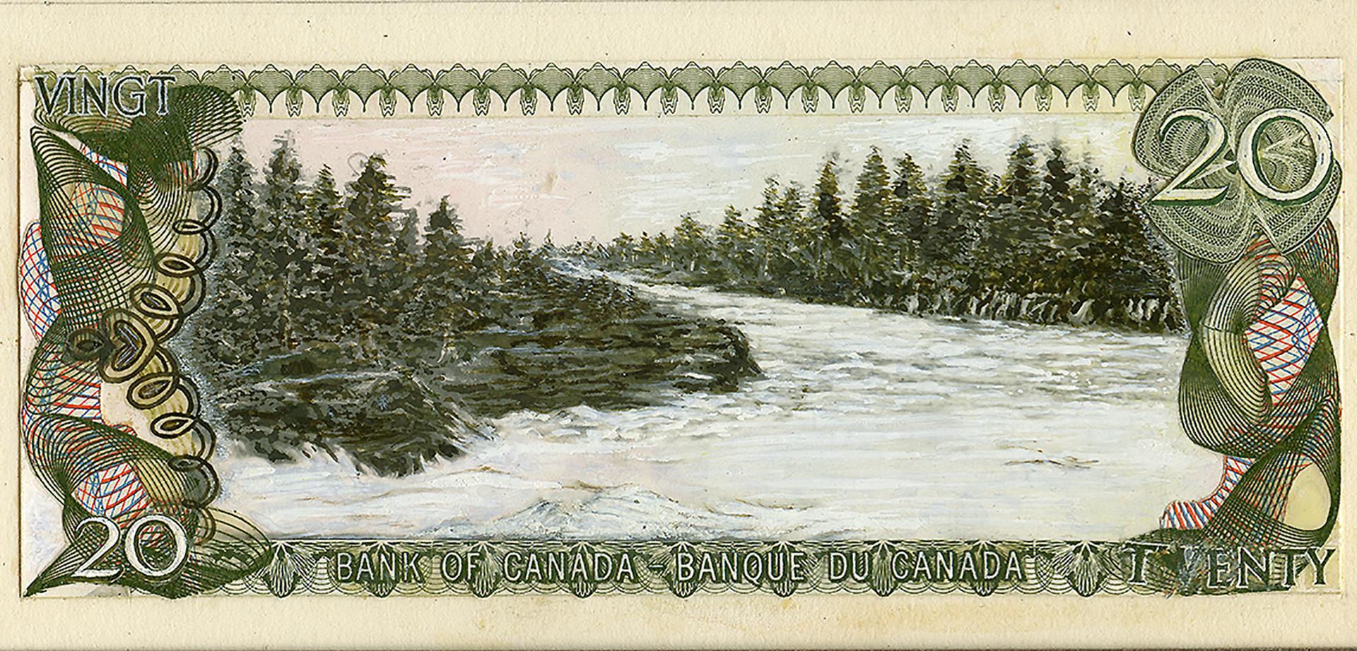
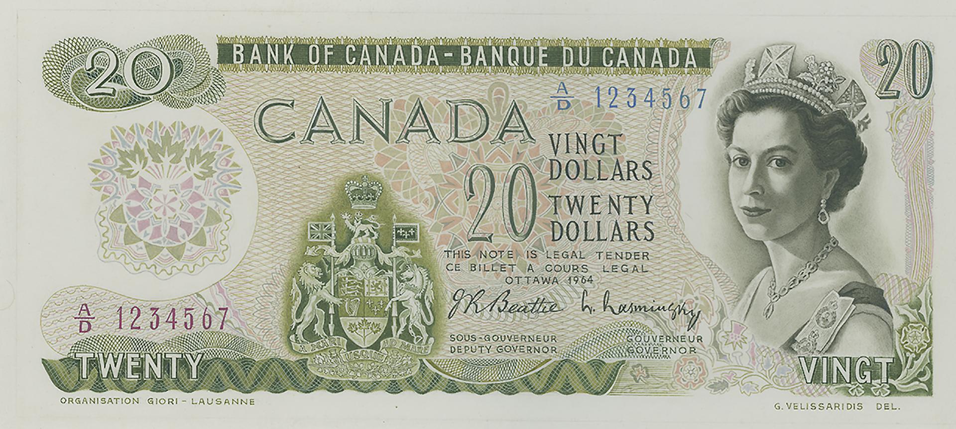
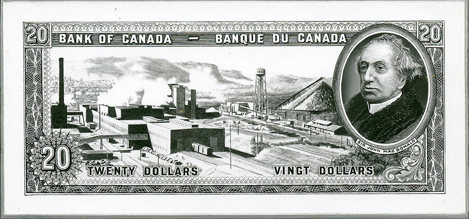
That’s not to say the chosen proposal wasn’t beautiful—it was. The British firm of Thomas de la Rue (now simply De La Rue) won the contract to design the over-all look and feel of the note, the framework and the patterning. With colours fading gently into one another and guilloche that flowed around and behind the denominations like fishing nets adrift in the sea, this note design was like nothing else in circulation. As in the previous series, the Bank planned landscapes for the back vignettes. An awesome view of Moraine Lake in the Valley of the Ten Peaks, Banff National Park was chosen for the twenty. But it was the colours that impressed the Bank, and it was no simple process to produce them.
The age before inkjet printers
Part of making a note difficult to counterfeit is using technologies unavailable to the counterfeiter. High-quality lithographic printing was one such technology. It had already been used in the 1954 series for colour tinting and shading on the portraits. The new multicoloured notes required a lithographic press that could lay down several colours simultaneously, and on both sides. This machine is called a Simultan press. The British American Bank Note Company and the Canadian Bank Note Company used such presses for printing the Scenes of Canada note series. At that time, colour photocopiers were not commercially available, but this would change in the mid-1970s and become a real threat to bank note security in the following decade.
The not-quite-right engraving
Although the note was shaping up very well, the original Alan Carswell engraving for the Moraine Lake vignette was proving unsatisfactory. Something was just a little off about it; it didn’t look real. The problem was thought to be with the original photograph. That photograph was actually a composite of several photos, likely created because the trees were not in the proper place to ideally frame the view. The printing firm had acquired photos of the same scene taken from different angles. Then, using good-old-fashioned scissors and tape, somebody, possibly the engraver, created a composite image of the scene that both suited the format and had better-placed trees. No computers—and no logging—required.
Watch our Curator David Bergeron wield the scissors as he re-enacts the assembly of the composite image.
Although painstakingly assembled, the image was replaced by another from the photographic collection of the Canadian Pacific Railway. Engraver George Gundersen used this new image as the reference for the final vignette.

The top image is the composite photograph used as a reference for the original engraving. Below is the painting created for the final engraving. Note its greater detail and gentler contrast.
Source: Photograph, Canadian Pacific Railway, Canada, 1965–7 NCC 2011.67.1104 | Painting, likely George Gundersen, Canada, 1967 NCC 2009.14.166
 compared with the original from De La Rue.")
The depth, clarity and grand scale of the peaks are much more enhanced in Gundersen’s engraving of Moraine Lake (bottom) compared with the original from De La Rue.
Source: Back model, Thomas de la Rue, Canada, 1967 NCC 2011.67.1109 | $20, Canada, 1969, NCC 1970.166.1
Evolution of a series
Initially, it was decided that our monarch would appear on every denomination of the Scenes of Canada notes, as she had on the previous series. Then in 1968, when the new $20 was nearing production, Minister of Finance E. J. Benson asked that some of the notes feature Canadian prime ministers instead of the Queen. Sir Robert Borden ($100) and William Lyon Mackenzie King ($50) joined Sir John A. Macdonald ($10) and Sir Wilfrid Laurier ($5). Macdonald and Laurier had been on our high-denomination notes in 1935 and 1937. The Queen remained on the $20, the $1 and $2.
And then the vignette subject theme got a tweak. The images on the rest of the notes would still be landscapes, but with strong elements of human activity. A broken log boom behind Parliament Hill, an Inuit hunting party, west coast fishing boats, a sprawling industrial site and a Nova Scotia seaport would soon become familiar Canadian currency icons. Then there was a ring of mounted police, but that’s another tale altogether.

Borden and King presided over Canada during wartime and depression. Each were strong promoters of Canadian sovereignty, independent of Britain.
Source: $50, Canada, 1975 NCC 1976.94.1; $100, Canada, 1975 NCC 1975.70.1
An old note gets some new tricks
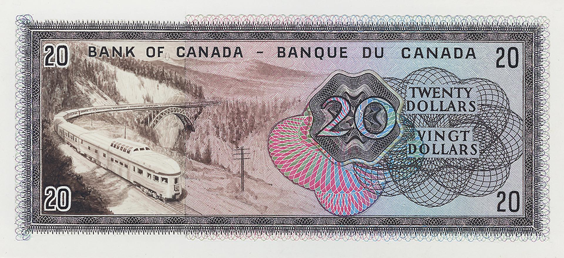
The $20 itself would go through some more changes. Part of the decorative framework disappeared from the back, replaced by machine-readable serial numbers. The colours were adjusted, the front side scheme becoming pinker to avoid confusion with the green $1 bill. Lastly, the vignette was no longer printed with the centuries-old intaglio process and lost its raised-ink texture. After 1984, the vignette was lithographed, like most of the front of the note.
As it went through its technological changes, the Scenes of Canada series became the forerunner of innovations that would become commonplace in the coming decades. In future series, all the back vignettes would be lithographed, and all notes would have serial numbers readable by automatic sorting machines. And the $20 was just the beginning.

Not only did the $20 become pink in 1979, but also the guilloche, number counters and part of the frame patterns changed substantially.
Source: 20 dollars, Canada, 1969 NCC 1970,166.1; 20 dollars, Canada, 1979 NCC 1989.10.56
Content type(s):
Blog posts
We want to hear from you! Do you have an idea for a blog post you’d like to see?
The Museum Blog
Reminiscences of the 1976 Montréal Olympic Coin Program
The Olympic Coin Program was novel, ambitious, record-breaking and for some, life-changing—much like the Olympic Games that the program helped finance.
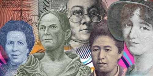
The changing face of women on bank notes
From queens to changemakers, discover how real women are finding their place on bank notes around the world.
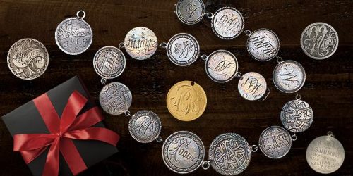
Love tokens: Change of heart
For centuries, people have been adding alternative messages to coins as political protests, advertising, commemoration and—most charmingly—love and affection. Such things are called love tokens.