Say hello to our new logo
Corporate logos are everywhere. They are so prevalent and deceptively simple that we often don’t recognize that they are extraordinarily sophisticated little symbols that carry a disproportionate amount of communication responsibility. For good reason, logo design is an elite field of an already complex business; the brainiest of all graphic design. To quote legendary graphic designer Paul Rand:
The principal role of a logo is to identify, and simplicity is its means... Its effectiveness depends on distinctiveness, visibility, adaptability, memorability, universality, and timelessness.
That’s a tall order. It’s all about identity, and part of the process of rebuilding a museum like ours is to rebuild its identity. The logo is a key feature and becomes nearly as important as the design of the museum itself because the logo is often the first impression that people will get of it. If our sophisticated new museum has a logo that looks like it belongs on a box of breakfast cereal, we may have difficulty attracting an audience. Conversely, it is possible to have a logo that is too impressive, that promises too much. Mr. Rand speaks again:
A logo derives meaning from the quality of the thing it symbolizes, not the other way around.
In the case of our logo development, many questions needed to be answered. Does it reflect our content? Is it memorable? Is it unique? Will it work alongside the Bank of Canada logo? Does it evoke our building? Can it work in multiple sizes? Does it make me look fat? OK, that last one’s pretty low on the list, but all the demands made upon this humble little design are a bit mind-boggling.
This highly adaptable design can be tilted, shifted, stretched and overlaid in many different ways and colours for any number of uses.![]()
And here it is. What do you think? Nice, eh? We like it. It’s a very flexible design and right now our graphics team is busy adapting it to a dozen different uses and formats. We believe it will serve us a long time and now we just have to make sure our new museum will be up to our logo’s standard. No problem there.
We want to hear from you! Do you have an idea for a blog post you’d like to see?
Content type(s):
Blog posts
The Museum Blog
October 29, 2015
Royal Canadian Numismatic Association
By: Raewyn Passmore
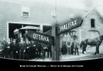
Nova Scotia has long been a centre of trade that connected Europe, New England and the West Indies. Following the American Revolution, Halifax became the primary British port in North America and a hub of financial activity.
Content type(s):
Blog posts
September 28, 2015
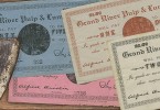
Merchant scrip from Labrador
By: David Bergeron
Before banks were established in remote regions of Canada, paying employees involved shipping currency long distances into wild and often lawless locations. The alternative to this risky enterprise was for the company to issue its own money. Called scrip…
Content type(s):
Blog posts
September 15, 2015
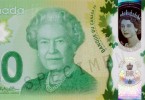
The 2015 Commemorative $20 Bank Note Revealed
By: Graham Iddon
It’s a historic day for us as well. It isn’t every day that the Bank of Canada introduces a new commemorative note.
Content type(s):
Blog posts
August 19, 2015
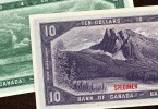
The 1954 series: the artwork of Charles F. Comfort
By: David Bergeron
During 1952, Comfort produced a number of pencil and watercolour design models for the face of the new notes. Some were updates of the traditional style while others were radically modern treatments.
Content type(s):
Blog posts